Colour uses in branding
The use of colour in branding is vitally important. At Robust Design we take on a whole variety of branding projects every year and one of the questions we are most asked is: “What colour do you think is right for my brand?”
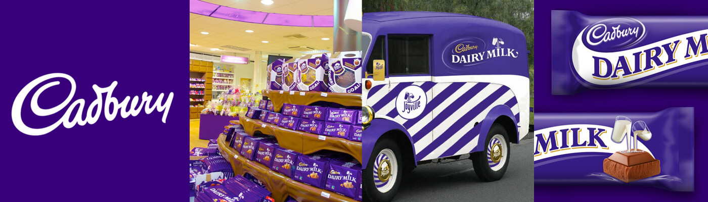
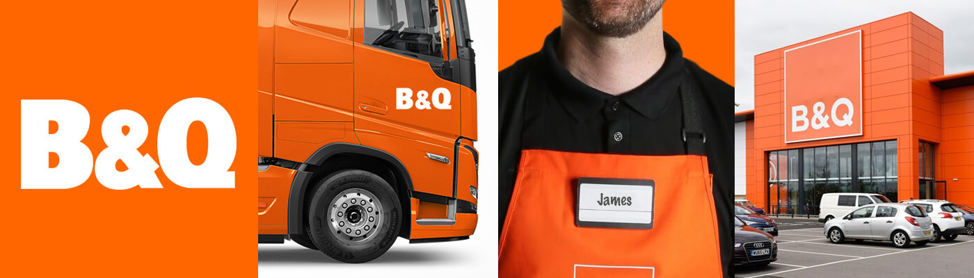
Every brand strives to find the unique colour that will define them and make them instantly recognisable. Many well known brands have a colour scheme that defines them; Virgin, Cadbury and B&Q. Brands such as these have such an affinity with their chosen colours that you cannot think of one without the other. Red, purple and orange will jump into your mind, just by thinking of their brand names.
When choosing a colour for your brand, you need to keep in your mind these three things that you will want your colour choice to do:
- Resonate with your target audience.
- Portray the emotion and tone of your brand.
- Stand out from your competition.
Audience
It is essential that you attract your target audience with your choice of colour, and you make them comfortable with your brand experience. Will men looking for a new razor be comfortable with a pink colour scheme? Take the time to research your target audience and consider your potential customer when choosing your colour scheme.
Just like the clothes we wear, the colour we choose is an essential first point of contact your customers will have with you. You must take into account your target audience, the emotion of the colour and your competition.
Emotion
Just like everything, colours have a deeper meaning that resonates with our psychology. When choosing the right colour for your brand, it is beneficial to know if your choice of colour has a good match on a subconscious level to the image you aim to portray.
 Red
Red
Passion, Importance, Attention
 Orange
Playfulness, Friendly, Vitality
 Yellow
Happiness, Optimism, Warning
 Green
Green
Nature, Stability, Prosperity
 Light Blue
Tranquillity, Trust, Openness
 Dark Blue
Professionalism, Security, Formality
 Purple
Royalty, Creativity, Luxury
 Pink
Pink
Femininity, Youth, Innocence
 Brown
Brown
Rugged, Earthy, Old-fashioned
 White
White
Clean, Virtuous, Healthy
 Gray
Gray
Neutrality, Gloom, Subdued
 Black
Black
Powerful, Sophisticated, Edgy
A large number of studies have taken place on the significance of colour in branding, and although we have provided to you a short example above of what colours can mean, we do encourage you to think outside of the box. For example, the colour brown can be seen as rotten in food brands, but chocolate lovers might love the colour brown.
Competition
Although colour can be the initial interaction a customer has with your brand, you have to remember it is not the ONLY interaction they will have. You should never be put in a position to just pick a random colour off the shelf because all the other colours have been taken by your competition. You can still create your own presence whilst having a similar colour scheme as your competition. You have to do what is best for your brand.
Should I pick more than one colour?
Many brands operate a multicoloured colour scheme. Think of Ebay and Google for some examples. When choosing multiple colours, the same principals above still ring true. Many brands will use one of these colour schemes:
Monochromatic
It's derived from a single base hue and extended using its shades, tones and tints. These are great for a minimalist look.
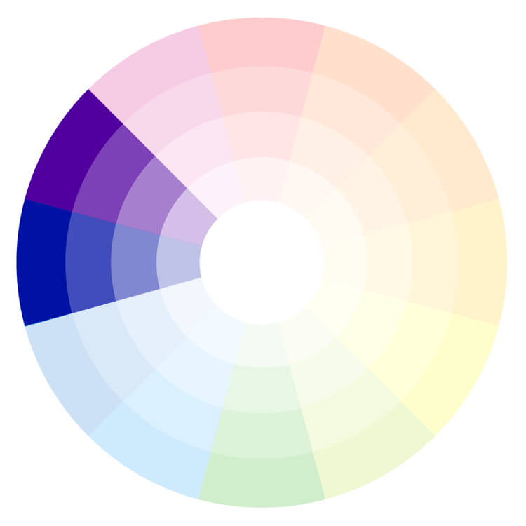
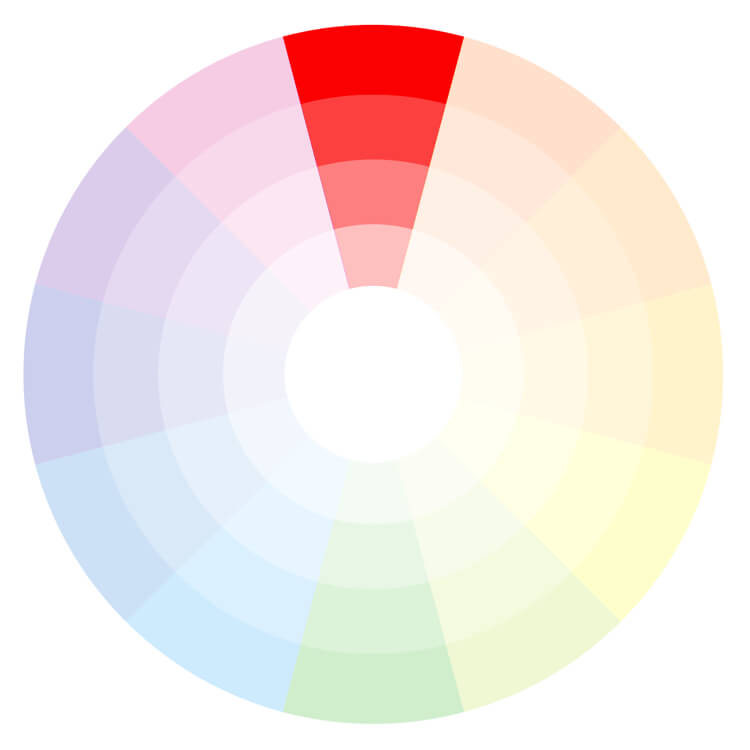
Analogous
When looking at a colour wheel, those next to each other work amazingly well as they will have similar emotional connections.
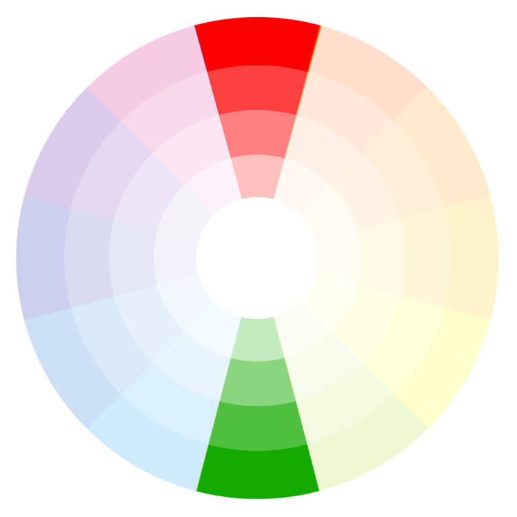
Complementary
Colours opposite each other on the colour wheel really complement each other and work incredibly well together.
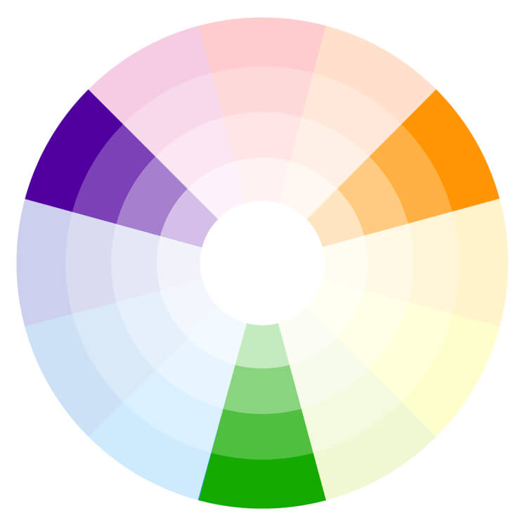
Triadic
Triadic colours use colours that are evenly spaced around the colour wheel. This gives a vibrant set of colours.
Using your colour
At Robust Design, one thing we will always encourage our clients is to ensure that the same colours are used throughout the business; from uniforms, decor, social media accounts and marketing materials. It is these contact points that will allow your customer to recognise you from every other business and strengthen your brand awareness as a whole.
Your colour choice
There are no strict rules on which colour scheme you should use, and there is no wrong or right answer. Don't neglect your gut instinct and do what you feel is best for your brand. Be sure to choose a scheme that you are proud to display and talk about. You must remember like your logo, a colour is only one part of your entire brand’s story.